From SNIP Rev 3.06 onward, the Web API now supports six new ways to plot a users movement with thematic highlights. Based on the plot style which you select, and the prior NMEA $GGA sentence information which that user has sent; colorized track plots like the below can be displayed over the Web API to any browser (or over the user reports requested from the SNIP windows console and displayed in the document viewer).
These maps are interactive, you can pan, zoom and scroll them as desired. You can press the icon in the upper right corner and the map will fill your entire desktop screen (click again when done). Whenever the page is refreshed (or another theme is pressed), the then-most-current data is plotted. The color scale used is adaptive to fit over the range of data present. The minimum and maximum values of the presented data is listed in the legend. If there are not any changes in the data values, this is noted in the legend as well. A small blue arrow indicates the last (most current) value on the legend.
Hint: Click to enlarge any image below
General Use
A set of buttons is used to control which theme will be displayed.
![]() These buttons are shown above the track plot in a user report. They are shown below the track plot if the plot has been opened in its own browser tab (press the Show In New Tab button in a User Report, or right-click menu item NMEA Plot from the list of user in Display Current Users dialog).
These buttons are shown above the track plot in a user report. They are shown below the track plot if the plot has been opened in its own browser tab (press the Show In New Tab button in a User Report, or right-click menu item NMEA Plot from the list of user in Display Current Users dialog).
No Theme. None
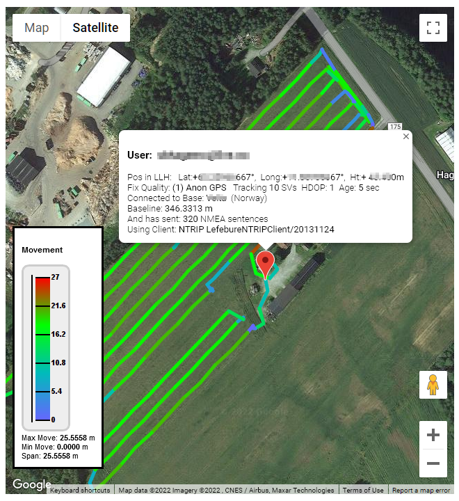
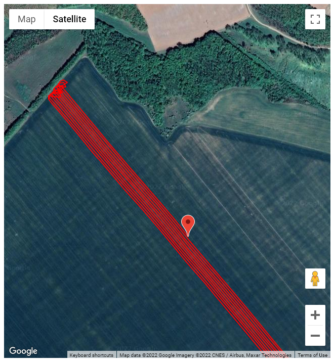 The initial method used to display a track of recent movements (show at the right) does not use any theme by design.
It simply plots the recent Lat-Long values from NMEA $GGA sentences for use on a Google base map.
An optional tool-tip can be displayed with further details about the user device when the red icon is clicked. The first image above shows this.
In the Preferences Dialog, you can control if the initial background is a “satellite” view (in fact these are aerial views) or a composite map view with roadways. Or you can click on Map or Satellite to toggle between these views.
Colorized by Height
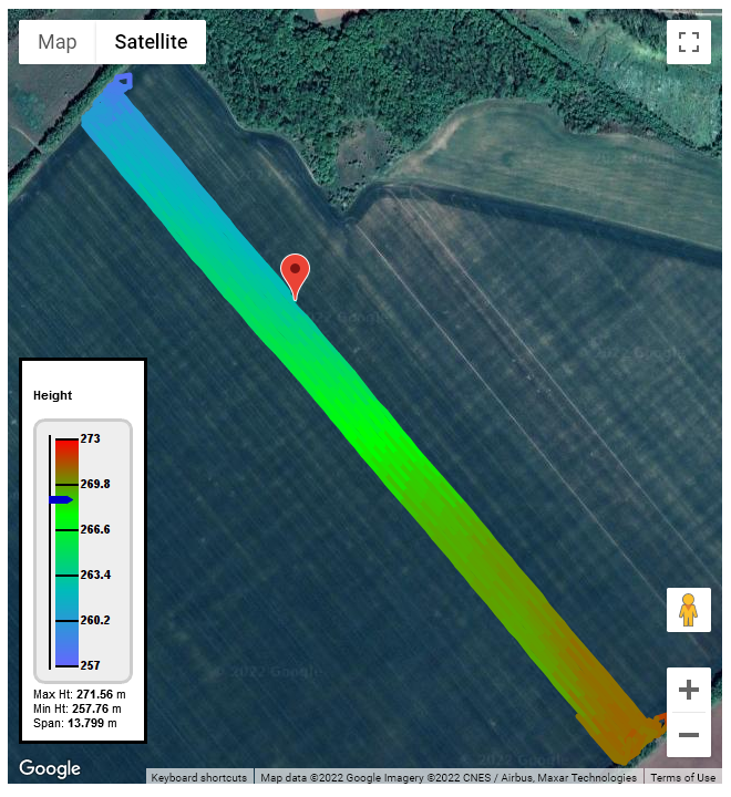 In this theme the height of the $GGA message is used to colorize the plot.
The values used by the scale in the legend is updated to match the data set, with red as the highest value, passing through green, and then dark blue for the lowest values.
In the example at right we have a Precision Ag user where the elevation varies by about ~14 meters from the upper West side to the lower East side.
As a general rule, applications in agriculture, marine use, and precision grading tend to be flat or gentle slopes. Construction with earth-moving, rough grading, and mining being the opposite extremes.
Colorize by GNSS State
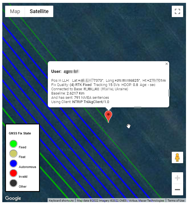 In this theme the reported state of the GNSS navigation filter as found in the $GGA message is used to colorize the plot.
This is the classic “Fixed” “Float” “Antonymous” (also called “Single”) display of the GNSS device.
Here we use discrete colors to represent each state. An invalid GNSS state (typical due to an inability to resolve any position) is shown with a red color.
There are a number of non-standard states in use by various devices as well. Examples include concept like “INS aided” or the use of RTCM 2.x messages. But neither NMEA or RTCM has agreed on their values and meanings. The theme shows these in a black color.
Colorize by Dilution of Precision (D.O.P.)
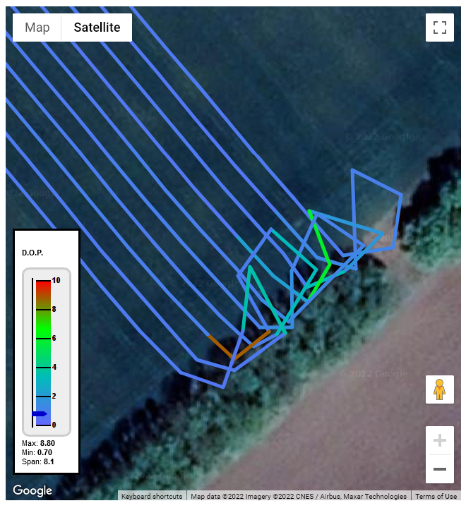 In this theme the reported DOP of the inputs to the GNSS navigation filter (as found in the $GGA message) is used to colorize the plot.
Dilution of Precision is a unit-less value that represents a multiplier of positional error that the constellation of SVs (satellites) causes. Under ideal conditions, the satellites are perfectly placed and the DOP is ‘1’
When some of the satellites are obscured (such as when operating near the tree line in the image at right), the value increases (which is of course bad). And positional accuracy then drops.
Historically, with only one GNSS system used (GPS or GLO), the best value was ‘1’ but today with multiple GNSS systems used in the same navigation filter, the value can be less than one. The precise meaning varies with each GNSS maker, but a larger number is always worse.
Colorize by SV Count (Space Vehicle Count)
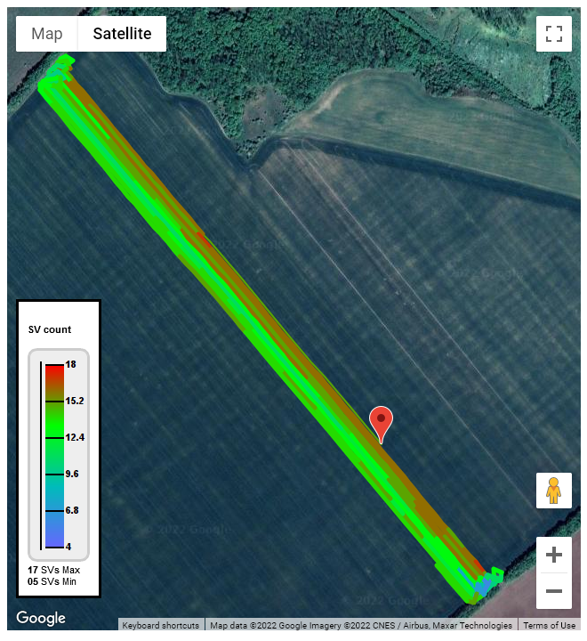 In this theme the reported number of satellites (SVs) used in the navigation filter (as reported in the $GGA message) is used to colorize the plot.
At least four SVs are needed to solve a navigation filter in both time and space. More are better as they allow obtaining a better DOP. Beyond a certain number (perhaps a dozen or so) having additional SVs may not be of value (as each SV has a unique bias noise of its own, adding more does not result in a zero mean average).
Kalman filter theory aside; when you see a plot where the number of SVs drops, there is often an obvious reason. Look at the base map for some sort of possible sky blockage (trees, slopes, buildings, etc.).
Aside: The number reported should be the SVs actually used by filter. However some GNSS devices will report the number of SVs that are tracked.
Colorize by Movement from Last Point
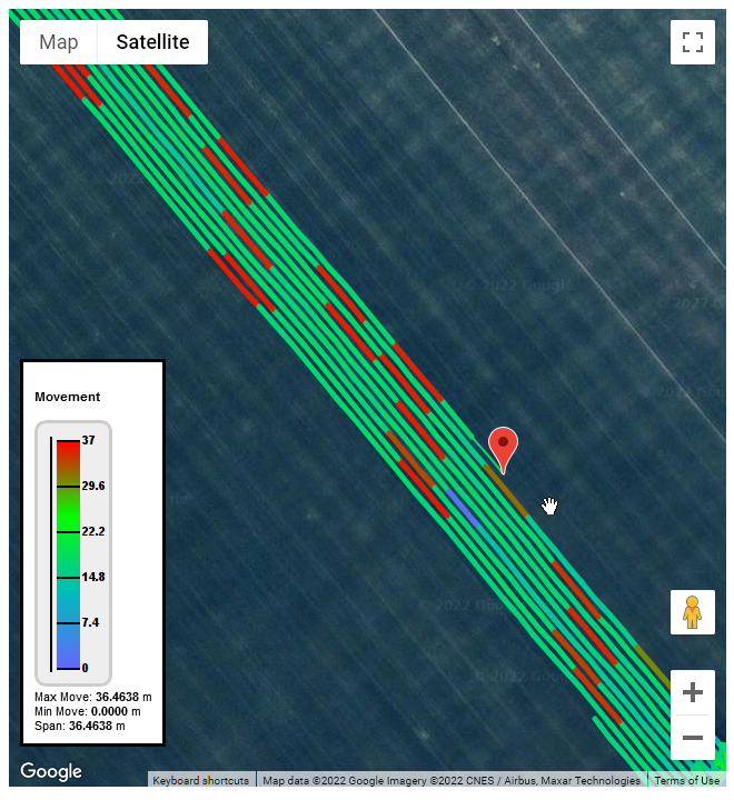 In this theme the relative movement from the last Lat-Long in the $GGA message is compared to the next one is used to colorize the plot.
Movement at generally steady rates produces a common color in the green color band while periods of slower operation produce blues (and high rates produce reds). You will see this in Precision Ag field work, and will notice it changes at corners and turning around points. Other applications (such as vehicles in street traffic) will have larger ranges as they start and stop.
We show the value in meters. We do not show the data in meter/sec as the rate of data updates (the rate at which the $GGA sentence is sent) will vary (often only one update every 5th or 10 second).
Colorize by Age of Corrections
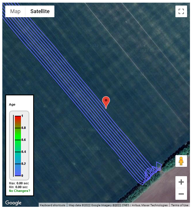 In this theme the reported age (in seconds) for the RTK correction sent from the Caster (as reported in the $GGA message) is used to colorize the plot.
Values under ~2½ seconds are typically not a concern. Values which jump a considerable amount indicate a poor connection (typically a marginal cellular link).
Many GNSS devices do not provide this field, or set it zero at all times.
This can also be affected by the navigation filter used in the NTRIP Client GNSS. Filters intended for highly precise semi-stationary application (such as land surveying) will accumulate and correlate measurements over a period of time (trading latency for greater accuracy). [The counter example would be an automotive navigation filter where promptness is desired.]
If you care to suggest any additional theme styles we should add, we welcome your input.
Please send your comments and suggestions to our normal support email address.